
Color Palette Inspiration: Spring

I don't know about you, but I could certainly use a boost from looking at some cheery colors this week! So this is a perfect time to consider website palettes inspired by spring photography.
The right colors for your brand depend on your industry, your personality type, and the feelings you're trying to convey. "Spring" palettes are typically upbeat, youthful, and positive. They're perfect if you work with children, as a party planner, or cupcake maker. Not so great if you're a tax advisor or construction safety consultant...
As usual, I suggest the palest color for your background, darkest color for text, brightest for buttons (Calls to Action), and the others as hover or accent colors.

Option 1: #134379 ; #F3F1ED ; #D16A86 ; #BDD4AD ; #C53E66 (I darkened the blue here so that your text will be easy to read. The blue sky is pretty, but not dark enough for good contrast.)
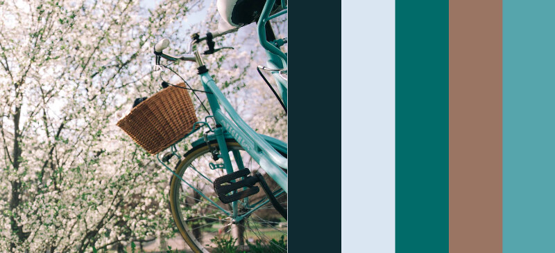
Option 2: #0F2B31 ; #DBE6F3 ; #006B68 ; #9B7563 ; #56A4AC
Website Spring Color Palette 3
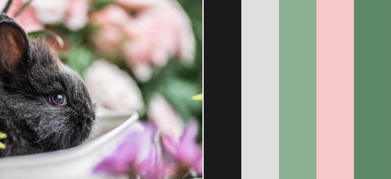
Option 3: #1C191A ; #DDDFE0 ; #8CB094 ; #F6C9CA ; #5D8967
If you're struggling with colors for your brand, working from a photo which appeals to you can be an ideal place to start. More often than not, I adjust colors once I see them "playing together" on a website, but any of these would be a strong beginning for a fresh, upbeat site. You might also want to review my autumn and winter photography-based palettes.
Do you feel your website has a "season"? If so, which?
Color Psychology Masterclass:
Want to dive deeper into all angles of Color Psychology for your website? My masterclass bundle is just $27 and will show you the savvy way to pick website colors that encourage your ideal client to take the next step. Learn more and buy here.