
Case Study: Choosing Website Colors
I get lots of questions about website colors, and lots of interest in my other resources on this topic, so today I'm taking you behind the scenes of the color choices for a recent website project.
My client Constance Hanstedt got in touch because she felt her existing website was no longer representing her in the best way. Since it was originally published several years ago, some WordPress technical glitches had crept in, and she also felt it was time to freshen up the look and feel of the site.
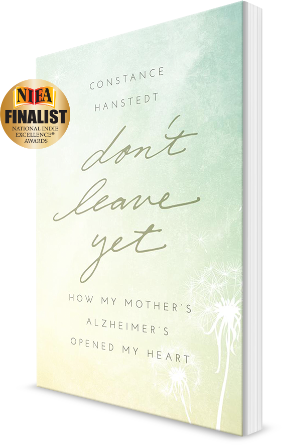
I agreed, not least because the cover of her published memoir, Don't Leave Yet, is so beautiful, and the current website wasn't allowing the book to shine.
1. Start with the big picture
Whenever I begin a website project, if my client has not already undertaken a professional branding exercise, I always spend time exploring with them the feelings and impression that they want to create online. We discuss what represents them best, and how they want to connect with their ideal audience.
In this case, Connie told me she wanted her website to convey that she is experienced and honest, and that her work is sincere, professional, and inspirational. Her memoir deals with Alzheimer's, so we felt visitors might also be looking for hope from her website.
2. Take inspiration

The beautiful book cover was an obvious place to start: Connie confirmed she loves this cover. This was a relief to hear, as I always feel sad when an author tells me they don't love their cover and don't want their website to look the same. But in this case, we had a strong starting point. Based on Connie's preferences, and her author headshot, we decided gentle blues would also play a part.
In terms of meaningful images, Connie guided me that dandelions are an important representation, so you'll spot this idea running through her site.
3. Decide on your color palette
If I'm creating a new color plan for a website, I rarely finalize the exact colors until I see them in place. Even if they seem great as "swatches", sometimes it's hard to be sure that everything will look amazing, and that there's sufficient contrast between the text and background. Here's the final color palette for this project:

If you're working on your own website project, don't be daunted by the number of colors here. You can work with fewer, especially to build your main design, then add subtle extras only if you find you need them.
4. Consider what to keep
You don't have to throw away everything when you decide it's time for a new website! In this case, this pretty signature (left) was in place, but I adjusted the color so it would look wonderful in the new website header (right):

5. Check your photos are on-brand

I'm a big believer that the photos you use on your website should look intentional, not just random selections that you picked because they were vaguely suitable and happened to be free! But that doesn't mean you need a huge photo budget, or your own brand photo shoot. For most of my projects, I search free photo libraries like Unsplash and Pixabay, choose carefully, then make small adjustments so that the photos look like they belong in your brand family. They don't all have to "match", they just need to look planned and harmonious.
Here, you see original photos on the left, adjusted for Connie's brand, on the right. We used these to add interest to her blog posts and poetry.
6. Bring it together
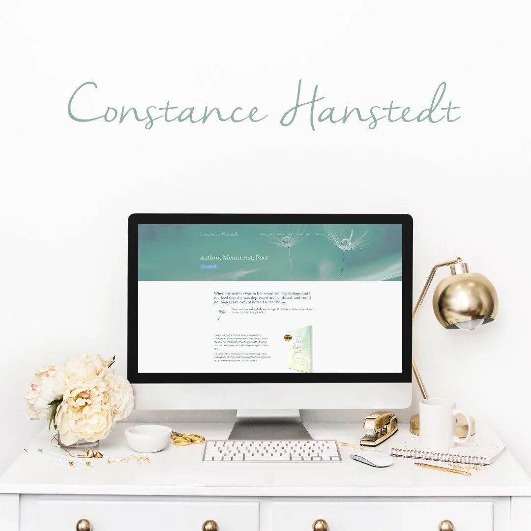
Clearly, there are many other decisions that go into designing and creating a website that doesn't just look attractive, but is effective too. I warmly recommend you visit Constance Hanstedt's website so you can explore not just these color tactics in a live setting, but the other aspects of her site too.
For now, here's a preview of the finished product:
Further website color resources
You might also like:
In addition to DIY resources, I offer full service website design where I will guide you through every step of a professional and beautiful site for your new business.