
Color Tips for Your Website
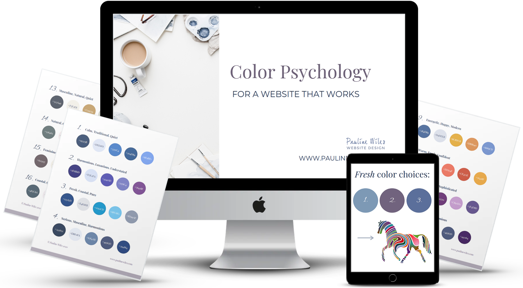
Want to dive deeper into color psychology for your website?
Grab this bundle and discover the savvy way to pick website colors that encourage your visitors to take the next step.
Masterclass Bundle:
Color Psychology Masterclass (video)
Quickstart Guide to Choosing Your Website Colors (video)
40 Done for You Website Color Schemes (swipe file)
Daunted by website colors?

One of my favorite parts of website design is working with my client to choose colors for their site. The right colors show off the personality of the website owner, support the message, create an appealing visitor experience, and are extremely important in encouraging that visitor to take action.
However, I know that color choice can be daunting. When I taught my first group website course, not many students nailed their palette without some prompting and assistance!
So, here's my framework for not only choosing, but also using your website colors.
How to choose website colors
Don't rush into choosing your website colors. Even if you're handling your website design yourself, your colors form part of your brand, so you'll want them to remain stable. That said, know that it can be hard to predict exactly how a web color palette will behave, until you see it in action. So your first attempt doesn't need to be your final choice. I frequently tweak a palette, once I've built an early version of a website.
Take into account:
Your preferences. If you hate yellow, for example, you won't want to use (much of) it on your website.
Your industry, and what your ideal client or website visitor expects to see. Knowing the gender of your ideal audience can be helpful, too.
What feelings do you want to convey? What adjectives should apply to your website? Trustworthiness, innovation, inspiration, romance, excitement, serenity, stability... and more, can all be signaled by appropriate colors. This is my favorite resource from Fiona Humberstone, on understanding the season of your brand.
What do you look good in and like to wear? If your website is an extension of you (as is the case for many creatives and solopreneurs), then this matters, especially if you do public speaking. Here's a good resource from Kettlewell Colours, to explore which colors look good on you.
Any important images or photos you plan to use. If your favorite head shot features a peach background, don't plan an orange website scheme. If you're an author and your book cover is pink and purple, don't develop a site that's lime green and blue. And so on.
For an in-depth tutorial on choosing your website colors, you might enjoy my Color Psychology bundle. Learn more here.
A foolproof website palette
For a novice, I recommend choosing 4-5 colors for your website palette. Many visitors will only notice 1-2 of them, so I'm not suggesting your web pages should be a riot of color!
You should select:
1) A pale background color. Many websites I design appear to have a white background, but of course white can be tinted in dozens of ways to offer great contrast with your text, but also to harmonize with the whole palette and not look too stark. With #FFFFFF representing pure white, I've recently used #FFFBE9 and #FAF7F2 as background colors:

2) A dark text color. Again, a very dark shade of blue, green, purple or grey means you don't necessarily have to go with black.
Reverse 1 & 2 if you're keen to have a dark background for your site. Just know that good contrast between your text and background is vital for an effective website. A visitor won't stick around if they can't make out your words. Check your choices for contrast here.
3) An eye-catching button color. This doesn't have to be neon orange, just something that shows up well on your background and suits the feeling you're aiming for. If in doubt, go a little brighter: vivid colors encourage people to take action by clicking.
4) An appropriate hover color. You don't strictly need to have buttons and links change when the visitor hovers, but it's a nice visual clue that they have found an action item.
5) Possibly one other accent color, depending on your preference. Your choice here depends on the overall energy you're aiming for. If you're hoping for a minimalist vibe, skip this. For an upbeat, fun, youthful site, add the accent.
Examples
Example website using quiet, conservative, toned down colors:

Example using fresh, vibrant colors:

Example where one color (purple) is the star of the show:

I've posted 12 further examples of done-for-you website palettes, drawing inspiration from each of the 4 seasons.
Tools for exploring colors
This article from Design Wizard is a helpful explanation of color theory, and defines some of the jargon you might come across. Be aware that the emotions associated with color mentioned in this piece are those we identify in western culture, and may not apply worldwide.
These are my favorite 3 sites for both exploring colors, and for keeping track of the ones you choose.
Palettte.app : You create your own palette here, and the tool reminds you of the relationship in terms of hue, value, and saturation of the colors you choose. If something looks "off", saturation is often a good setting to explore.
Coolors.co : This site is well-known for helping you generate a color scheme. Hit the space bar to see suggestions, then "lock" a color when you like it.
Design Seeds : A lovely site for color inspiration. Many of the palettes are inspired by nature photography. Browsing here counts as self-care, in my opinion!
I generally use palettte.app for storing the color codes of the websites I'm working on. It doesn't matter where you note your colors, just make sure you have them handy. The "hex" code, which looks like #E9CBD1 or #798F8C, is all you need for online design work. (Requirements for professionally printed projects may be different, but that's another story!)
Tips when using color in Carrd
Carrd.co is a drag and drop website builder that many people find (fairly) intuitive and fun to use. However, having watched my students work on their websites, I noticed a few common color blunders.
Here's a checklist of what to remember about color in Carrd.co
Be consistent. This is the golden rule of creating a professional-looking website that builds trust with your visitor. Make sure that if your text is emerald in one paragraph, it doesn't slip into Kelly green in the next. Carrd offers you the ability to create styles for both text and buttons, making it much easier to keep everything looking the same. I wrote more about styles in Carrd here.
Watch out for hover colors. It's easy to set the colors of buttons and links and forget that the Carrd template you chose may have a pre-set color, that shows up when a user hovers over an element. More often than not, the hover color is completely wrong for your color scheme, so be sure you've found and updated all of the places where they occur.
Carrd templates are all stylish "out of the box", however contrast can sometimes be an issue, with default text often a grey shade. Darken the text if you need to, and remember that changing the weight of a font can also appear to make it darker, even if it's actually the same color.
If you use a photo instead of a background, be vigilant to make sure the color of your text shows up. This is especially important to check on a mobile device, as the photo dimensions will change. Text that was perfectly legible when you viewed it on your desktop browser may sit on a non-contrasting part of the photo, when on a small screen.
If your background photo is too vivid, Carrd has excellent overlay options where you can choose not only a color to tint your image, but the transparency too. Use this for a subtle, barely-there effect.
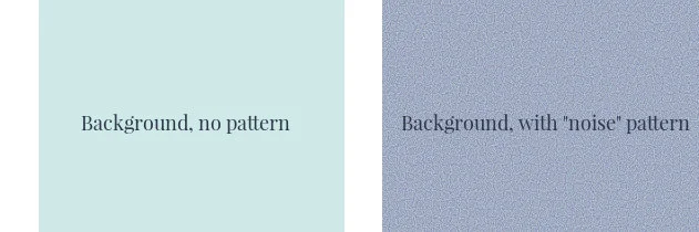
When using colored backgrounds in Carrd, check whether a pattern is being applied automatically. The "noise" pattern, for example, adds a nice textured effect, but depending on its color settings, it will make your background appear different and/or "dirty". These background colors are the same, but the pattern settings make a big difference to what we see:
Color Psychology Masterclass:
Want to dive deeper into all angles of Color Psychology for your website? My masterclass bundle is just $27 and will show you the savvy way to pick website colors that encourage your ideal client to take the next step. Learn more and buy here.
In Summary:
Be intentional about your website color choices.
If you're a beginner, don't pick more than a few shades.
Consistency and contrast are both vital.
Learn a few Carrd.co color tricks, to achieve a truly professional result.
Choosing and using website colors can be an enormously fun part of your website project!
However, if you lack color confidence or would like another opinion on your intended website colors, I provide full-service, custom website design. I'm happy to chat and you can schedule your free consultation here.