7 Squarespace Tips to Make Learning Easier
• This article contains affiliate links for Squarespace •

I love Squarespace. Among website tools, I find it offers the best balance of looking great, strong SEO, and being fairly easy to use.
However, I know from working with my clients that there are still a few things that are confusing. Here are the most likely areas where you might trip up as you’re learning, and my Squarespace tips to get you working faster and with more confidence.
1. Don’t worry about which template to pick
Great news! Unlike other platforms like WordPress, where your original choice of “theme” is hugely important, on Squarespace version 7.1, it really doesn’t matter at all.
(On version 7.0, template choice does matter, but I strongly recommend against starting a brand new site on this older version.)
So if you’ve felt paralyzed by this, just move forward and start to create your Squarespace website.
Although you’ll save some time by beginning with a template that is close to the layout you want, with Squarespace 7.1, you can arrange and style everything, regardless of the initial pages.
For all the details on why template choice doesn’t matter in Squarespace, see What is the best Squarespace template?
2. Take care not to delete a section by mistake
As you begin learning Squarespace, you’ll notice that the different types of content on your web page are called blocks. You might have a block for text, an image, a button, and so on. Every block can be deleted by selecting it and then clicking the Delete (Trash) icon.
It’s highly likely that your Squarespace page is also divided into horizontal slices, known as sections. Often, a clue for a new section is that the background color changes, part way down the page. There are some controls that relate to the whole section, and if you’re editing on a desktop or laptop, these will appear in the top right corner of the current section.
If you have a content block close by, there’s a risk that you think you’re deleting just the small piece of content, but in fact you’ve landed on the delete button for the whole section:
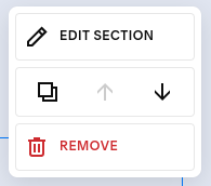
Section controls appear in the top right corner
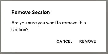
If you see this confirmation message, just make sure you do indeed want to delete the section, instead of just one content block:
3. You don’t always need to click Apply to save a link
Squarespace isn’t totally consistent with the number of clicks you’ll need to link text, buttons, or images to other pages or other websites. When I was a Squarespace beginner, I kept missing out the final step needed, whenever I was adding a link. Chances are, you’ll slip up here too.
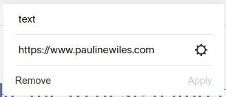
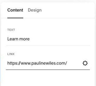
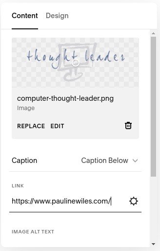
To link a piece of text, enter the url and click Apply (below, left)
To link a button, enter the url and then just click away. There is no Apply here. (below, center)
To link an image, enter the url, complete the other image settings (like Alt tag) as needed, and click away. There is no Apply here. (below, right)
In all these cases, you do then still need to save the page as a whole, before your changes are final.
4. Spacer blocks are on their way out
The new Fluid Engine drag and drop editor in Squarespace has made spacer blocks a thing of the past. So if these are driving you crackers, it could be time for you to learn this new layout tool! It’s available in version 7.1 only.
Spacer blocks were vital in the old, “classic” Squarespace, for adding empty space in your design. Blank space is a wonderful way to bring a professional look to your web pages, by giving room around your content and a little pause so the visitor’s eye doesn’t get overwhelmed.
In the older “Classic” editor, spacer blocks were used not only to leave some horizontal space between content, but, vitally, to specify that a block should not take up the full page width. Without a spacer block, every piece of text, image, or other content would try to take the whole width of the space available. So, it was standard practice when creating a Squarespace website to use many, many spacer blocks.
Squarespace spacer blocks example
However, many Squarespace customers struggled with positioning these spacer blocks. Although they could be dragged and dropped, they certainly could be fiddly! And using them well needed an appreciation of the “blue line” that indicated how content would behave, and wrap, on a mobile device.
The good news is, for most pages, Fluid Engine has made spacer blocks obsolete. Here’s my complete guide for getting started with Fluid Engine.
The not so good news if you hate spacer blocks: for the time being, Squarespace blog posts still use the Classic editor, so you will still benefit from a basic awareness of what they do. Here’s the Squarespace guide to spacer blocks.
5. It’s really important to check mobile view
Out of all of these Squarespace tips, this one might be the most crucial.
Professional web designers have always been aware of the importance of checking a page on different screen sizes. These days, many website tools facilitate “responsive” design, but there really is no substitute for keeping an eye on the results yourself.
Squarespace is no exception. Most of what you design will resize perfectly and look great on different sized screens, however, the recent introduction of the Fluid Engine editor has brought both pros and cons in this respect.
Fluid Engine gives you much better control than before over how you want to arrange your content blocks on a mobile-sized screen. I love the new options to make clear, attractive mobile websites. However, because you have better control, it is now imperative that you check the mobile layout, on every page you publish.
Squarespace makes it easy for you to do this: you can toggle between Desktop view and Mobile view in the top right corner, when you’re in edit mode:

Controls for mobile and desktop view
And it’s important to know, when you add several content blocks to a section using Fluid Engine, in the (default) Mobile view, Squarespace will sometimes arrange them in the order that you add them.
So, for example, in Desktop view, if you create a headline, add three pictures, then realize you need a paragraph of text before the pictures, it’s natural that you’ll simply rearrange these pieces to look good on the page. Don’t forget to visit and work on the Mobile view too, where you’ll probably find that your content is stacked vertically, showing up as Headline > Picture > Picture > Picture > Paragraph.
Once you get into the habit of designing for both layouts, I think you’ll love Fluid Engine. But Mobile view is definitely a pitfall, when you’re first learning Squarespace.
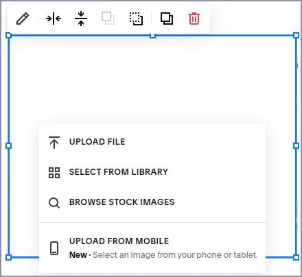
6. You don’t need to upload the same picture multiple times
You might want to use the same picture in multiple places on your website. For example, your book cover might feature on your Home page, Book page, Media page, and in one or more blog posts.
For speed, and your sanity when working later with images, don’t keep uploading the image file from your computer. Just upload it the first time you need it. Then, later, reference the image that’s already stored for you by Squarespace.
Re-use an image, for a single image
When you’re inserting a single image, simply click Select From Library to see the images that you’ve previously uploaded to your website:
Re-use images, for a gallery
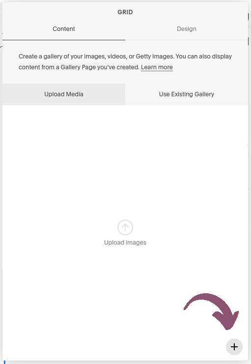
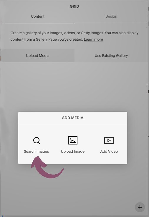
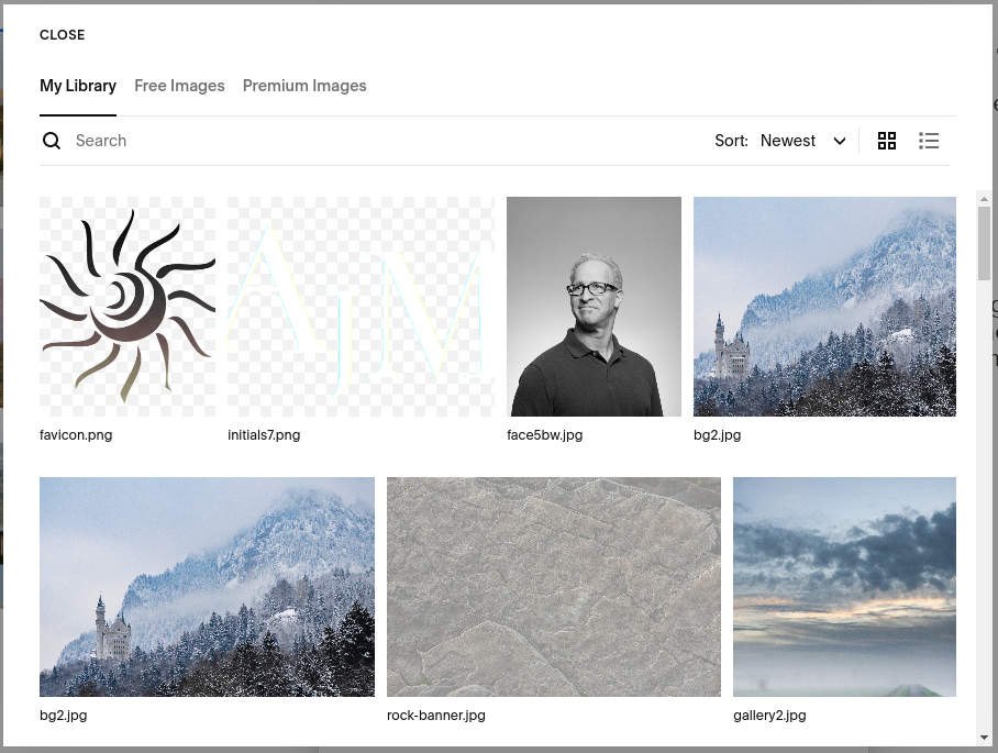
And if you’re creating a gallery, it’s also possible to pull from images you’ve already uploaded, but there are a few steps:
Insert a Gallery block
Click the + icon, bottom right
Choose Search Images
Select one or more images from your existing library
7. In a pickle? You can always back out and try again.
Remember, whenever you’re editing a Squarespace page, if you get in a tangle, you can leave the page without saving your changes. To do this, hover over Done in the top left, and choose Discard Changes.
Bonus tip: as you’re creating your Squarespace website, save your page changes regularly. That way, if something does go wrong, you can back up to the last “good” version that you made.
•
Overall, is Squarespace good for beginners?
Squarespace is a wonderful website platform and a beginner can certainly create an attractive and functional online home. However, don’t expect to spend 30 minutes and have a professional quality site. Like any other powerful tool, you’ll need to invest a bit of time learning Squarespace, in order to get the best out of it.
Hopefully, these tips help you avoid the most common areas of confusion.
•
Would you like me to design and build your Squarespace website?
There are dozens of considerations in creating a strong author website. Bringing the right pieces together for you is what I do best.
As a professional specializing in strategic websites for authors and solopreneurs with books, I’m an expert in the features you need for a website that connects with your audience and gets business results. If you’d like niche expertise, top quality design, and your technical headaches solved, consider hiring me.
After careful preparation together, I’ll design, build and launch your site in just 2 weeks. Learn more, and then schedule a complimentary consultation.