
How to Make Squarespace Less Square
• This article contains affiliate links •
One of the things that people sometimes worry about with Squarespace is that your website will look the same as others. This “cookie cutter” fear usually shows a lack of understanding about how Squarespace works, including why your initial template isn’t important, and how adding your own colors, fonts, and images makes a massive difference.
However, a few years ago, it’s true that the typical Squarespace website did consist of a lot of straight lines. Happily, in recent months, Squarespace has released several new features that allow you to design pages with a lot more curves and softer divisions.
Here are some of my favorites. None of them require coding; you can simply use the drag-and-drop Squarespace editor to achieve these effects.
Before you start:
The information here applies to Squarespace version 7.1; some of the tips need the newer Fluid Engine editor
These ideas will work with all pricing plans in Squarespace
Save 10% off your first subscription of a Squarespace website by using the code PAULINE10
(Reminder! Whenever you edit your pages in Squarespace, be sure to check mobile view and make any necessary adjustments to your layout. This is a frequent beginner mistake, and will undermine the professionalism of your website.)
Watch video instructions: making Squarespace less square
Here’s an overview of what you’ll see in the video:
> Applying shapes to Squarespace images
skill needed: low • timestamp: 00:40
Click into Edit mode
Click your image
In the Design tab, click Shape and configure what you want
When happy, Save your page

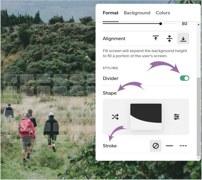
> Applying curves, diagonals, and other shapes for a section divider
skill needed: low • timestamp: 01:48
Click into Edit mode
Click Edit Section, corresponding to the higher of the two sections
Scroll down the Format tab until you see Divider, and click to activate this
Select the Shape of the divider you want
Choose Stroke to control whether there is a line at the edge of your section, too
When happy, Save your page
Reminder: check mobile view, to make sure you’re happy with how this looks there, too
> Introducing a curved effect using scrolling text
skill needed: low • timestamp: 03:55
Click into Edit mode
Click Add Block and choose Scrolling
Click the pencil icon for the scrolling text, then the Design tab
Change Wave Intensity to add a wavy effect to the text
When happy, Save your page
Reminder: check mobile view, to make sure you’re happy with how this looks there, too

> Why, as a designer, don’t I add more of these features?
timestamp: 5:13
Simply put, less is more. The best website designs are simple, intentional, and elegant. They keep the focus on your content, your message, and your call to action, not on all of the fancy tricks that are possible inside your website tool.
Remember, just because you can, doesn’t mean that you should!
> Books often look best with an angular design
timestamp: 05:58
In particular, book covers often lend themselves to website pages with a square design that echoes the book. Again, it’s essential that your book cover is the star of the show. The other pieces of your web page are there to play a supporting role, not to take the attention away.
> How to make an image overlap sections in Squarespace (no code needed)
skill needed: medium-high • timestamp: 06:40
Using the Squarespace Fluid Engine editor, you can make things appear to cross sections, even when they don't.
This technique is best shown in the video, however, your basic steps are:
Click into Edit mode
Turn on your grid guidelines (press G on your keyboard), so you can see what you’re doing
Make sure these gridlines extend all the way to the bottom of the section, by toggling the Fill Screen option in the section settings
Add a rectangle shape, and change its color to match the section below
Place the rectangle at the bottom of the upper section and drag its edges all the way to the left and right edges of your screen
Move your image so that it sits on top of the new shape
Essential: check mobile view, to make sure you’re happy with how this looks there, too

^ Watch the video to see how to make this image appear to overlap the section below
Fun backstory: how did Squarespace get its name?
With hindsight, I wonder if the founder of Squarespace would choose that name again. After all, it sounds a little, err, limiting and confined, does it not?
Apparently, Anthony Casalena chose “Squarespace” because computer monitors used to be square and this was therefore the available space.
I’ll be curious to see if Squarespace re-brands itself in future, but for now, it’s good to know your web pages only need to look square if you want them that way. We have plenty of options for bringing softer lines into your website design.
•
Would you like me to design and build your Squarespace website?
Prefer not to spend your time and energy learning tricks like this?
As a professional specializing in strategic websites for authors, consultants, and speakers, I’m an expert in the features you need for a website that connects with your audience and gets business results. If you’d like niche expertise, top quality design, and your technical headaches solved, consider hiring me.
After careful preparation together, I’ll design, build and launch your site in usually just 2 weeks. Learn more, and then schedule a complimentary consultation.